Best Papers For Marbling: New Tests & Favourites
09/03/2021
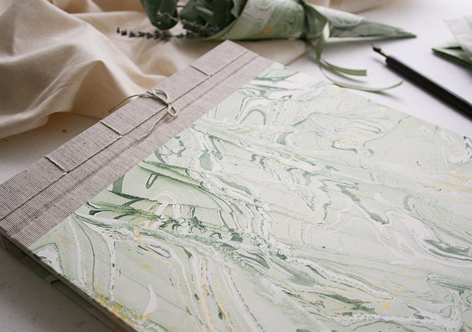
Wedding Stationery: A Marbling Dream in Green
07/06/2021Recently I had the opportunity to work on a couple of custom projects. One of the customers asked for a guest book matching the theme and mood of a Quinceñera party, while another customer was looking for a journal with a colour palette matching their corporate branding. Working on personalized book projects is always exciting and challenging. I usually create different designs that I later show to the customers to let them pick their favourite ones.
Most of the times I get clear indications on colours and patterns, sometimes I have total creative freedom. Whether you are working on a custom project or just marbling for fun, I recommend you to create colour palettes and a mood board. Why? Simple. Marbling offers you infinite possibilities. Once you start marbling, you can quickly get overwhelmed by the huge amount of colour and pattern combinations. Defining a colour palette in advance and working towards a mood board will help you set some healthy limits to your creativity, save time and materials and give you a feeling of accomplishment when you finish a full-rounded project.
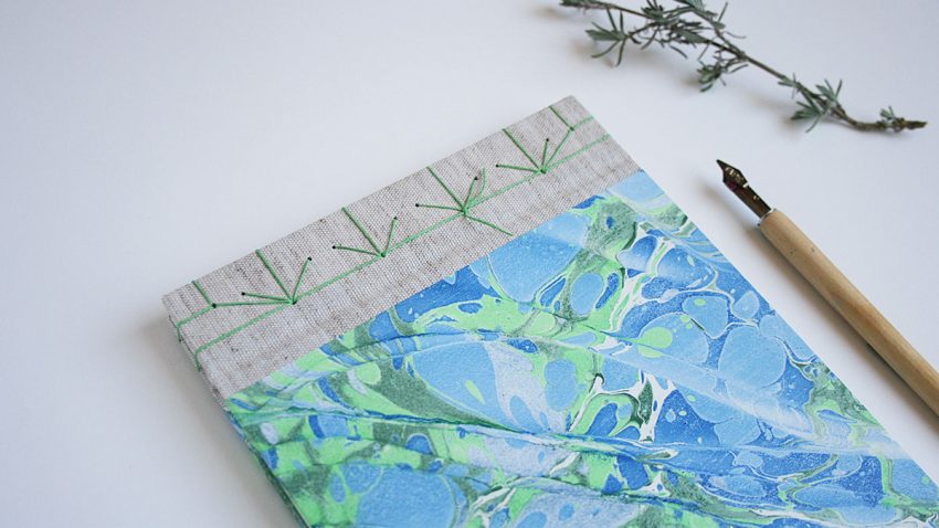
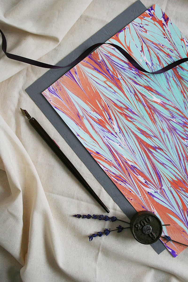
One of my latest works: a Japanese journal with hand-marbled covers in Spanish Wave pattern.
-
What is a colour palette
A colour palette or scheme is basically a combination of different colours used in a particular context or project with the goal of creating a specific look & feel. Your palette can be built out of two or more colours. Choosing one colour over others will depend on various factors: your preferences or project requirements (e.g. corporate colours), and especially on how the colours look together.
Have you ever heard about colour theory and the colour wheel?
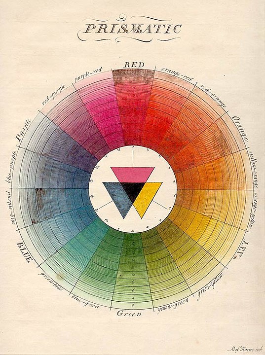
The Natural System of Colours by Moses Harris (Source Wikipedia).
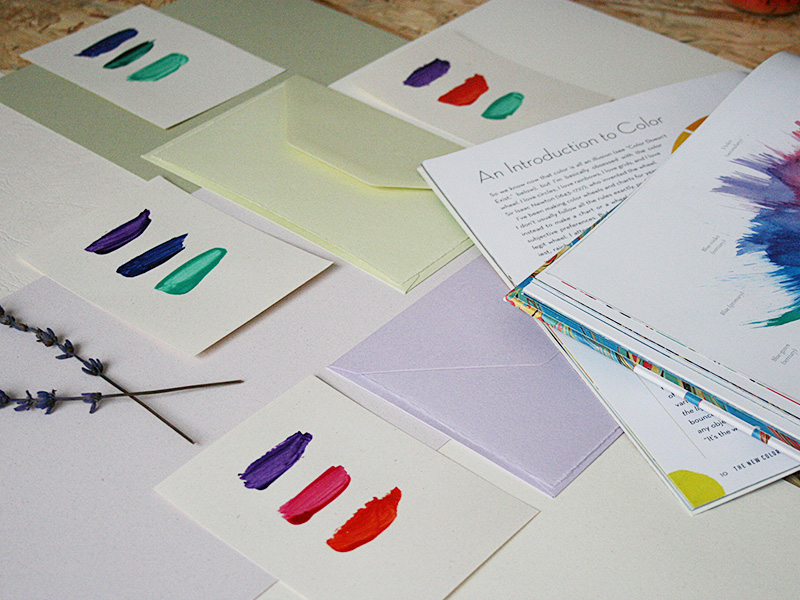
Colour palette designed for a blog post collaboration with Papier Direkt.
-
How to make colour palettes
Colour theory has been the subject of thousands of books and articles. So, I would refer you to a quick search on the Internet to learn more about this interesting concept. For the purpose of this blog post, it’s enough to say that colour theory brings together science and art to determine which colours look better together.
In 1666 Sir Isaac Newton designed the colour wheel, in an attempt to classify primary, secondary and tertiary colours and being able to find matching combinations within them. Depending on the colours you choose from the colour wheel, you can create complementary, analogous, triadic combinations and more…
Before I start a new marbling session, I use the colour wheel to determine which colours I would be combining for a specific paper design. I take a piece of paper and paint a few brushes with each of the colours I consider using. The final colour or tone on the marbled paper will look slightly different than the one on this piece of paper, but this gives an idea of the final look. Furthermore, I can keep this colour card for future projects or my marbling archive.
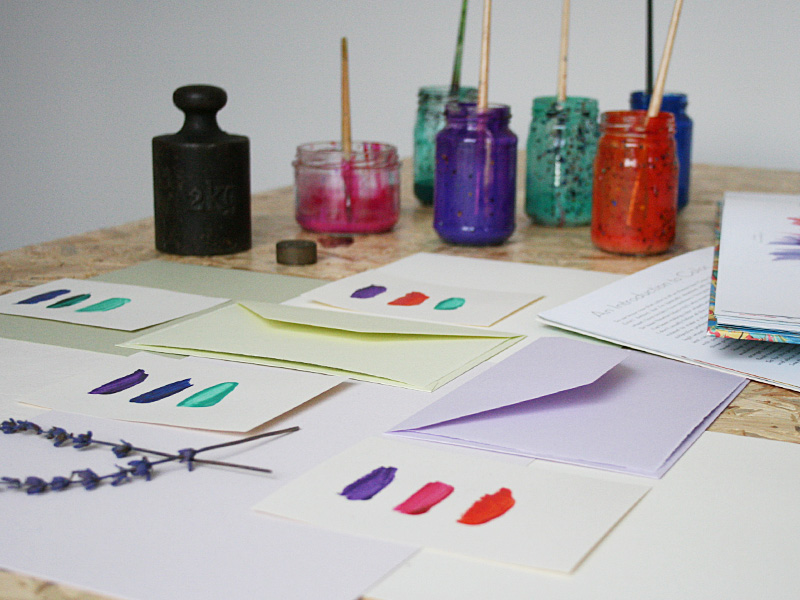
Colour palette designed for a blog post collaboration with Papier Direkt.
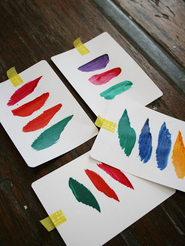
Colour palettes in my studio in Munich.
-
Where to find inspiration for your colour palettes
Let’s say you have complete creative freedom to pick up the colours to use on your next marbling project. You can go with your favourite colours or ask your friends for their colour preferences and let them inspire you. But picking colours is like picking your clothes for the day: you can stay in front of your wardrobe for hours and still not be able to make a decision.
An easy-peasy way to look for colour inspiration for your marbling projects is flipping through magazines, looking at ads prospects or searching on the Internet, e.g. on Pinterest. Nowadays there are thousands of sources where you can find ready-to-use colour palettes and schemes.
There are also online tools that help you find out which colours combine better together, e.g. this colour wheel from Canva.
-
How to make an inspiration mood board for your marbling project
Picking colours on an online colour wheel or saving colour schemes on your Pinterest board is easy and quickly done. But sometimes we need more than a digital visual guide. When working on long-term projects, I like to have a real mood board, something I can touch with my hands and see every day on the wall in front of me. There are no rules or limits. As a matter of fact, the more variety the better.
All kinds of materials are allowed on mood boards: paper, fabric, flowers, tape, objects… the process is very simple. With your colour palette in mind, look for similar colours and textures on magazines, flyers, in your garden, in your craft room. Pick a few objects and tape them onto a wall. Look at your mood board every time you are working on your marbling project and let yourself be inspired by the textures, tones, look and feel.
Don’t be afraid of trying colour combinations you wouldn’t consider at first. Colours can surprise you and who knows, maybe you even end up adding a new favourite colour to your list. When we get out of our comfort zone and push our limits we discover new things about ourselves.
Feel free to drop me a message via the contact form or on Instagram if you have any question about creating colour palettes for your marbling projects. Or download my free guide Top 10 Marbling Tips & Tricks for more helpful insights into the world of paper marbling.
Your crafty fellow,
Karen


